Small business branding is like shopping for jeans. Rarely does the first pair fit just right. But when you find THE jeans, the fit is *chef’s kiss.* Of course, styles and bodies change, and you eventually outgrow that perfect pair of jeans.
That’s how I felt about my brand and website last year. I hadn’t updated my own small business branding in 4+ years, and while it served me well, it no longer fit… kind of like the ultra-low-rise flare jeans I wore in high school. It felt like looking at an old photo of myself.
Enter the rebrand.

Whether you’re considering a rebrand of your own or you simply enjoy an HGTV-style digital home makeover, this post is for you. I’m breaking down:
- Why I rebranded
- How the process unfolded
- Who helped bring the vision to life
- What I did differently on my new website (and why)
First, what IS a brand?
Myth: a brand is just a logo and colors.
Fact: your brand is a complex ecosystem that affects how people feel.
It’s easy to get caught up in brand aesthetics: the colors, images, and typography. I get it – making things pretty is fun! But your brand is so much more than a logo and color palette. It’s the personality of your brand.
Your brand personality shapes how you show up and how you make people feel.
For example, Liquid Death built a $1.4 billion dollar canned water empire on edgy, outlandishly funny branding. It’s just canned water. But the brand raises eyebrows, makes you look twice, and stands out among a sea of “mountain fresh” blue bottles. The product itself is not innovative – but the brand and marketing make big, watery waves.
That’s the billion-dollar power of branding.
Even in a saturated market (see what I did there…? 💧), your brand can stand out by being the black can in a room full of blue bottles.
People buy from brands that capture their attention and make them feel something. They might buy a can of Liquid Death because it made thm chuckle. Or a bottle of wine because the label reminded them of a once-in-a-lifetime dinner in Italy.
The takeaway? Find your story and tell it in a way that makes your audience feel something. Do that, and you win their attention.
Why I decided to rebrand my copywriting studio
Fun fact: I won my previous brand identity for free through an Instagram contest in 2019. Before that, I didn’t really have a brand – it was just me, DIYing things with templates.
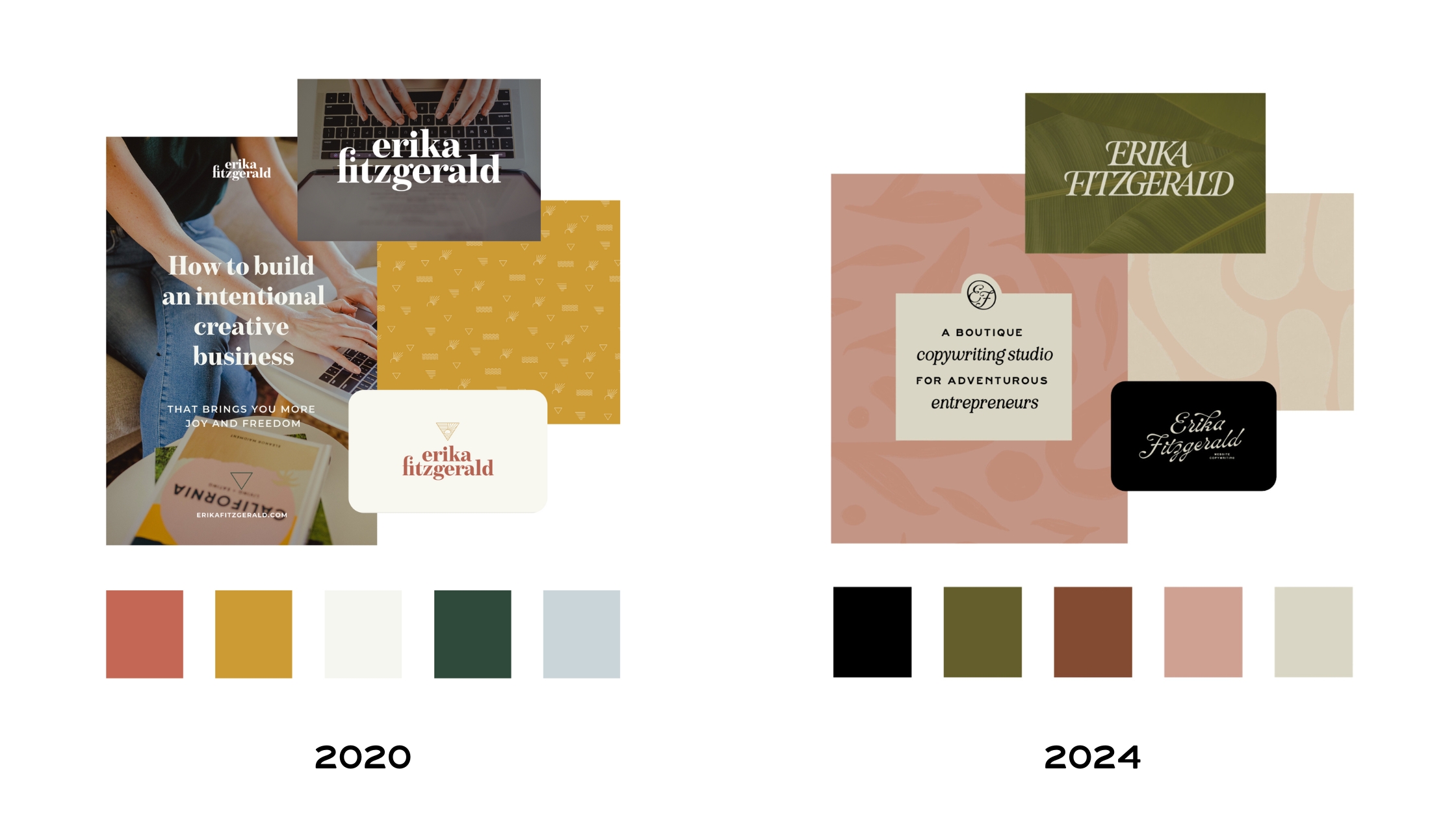
In 2019, I was still ramping up as a full-time business owner and had just moved back to California after a year abroad. I wanted my brand to feel like, and I quote, “a California sunset” with a triangle to represent strength. (…as if the triangle tattoo on my back wasn’t enough geometry.)
The problem? I didn’t take my own advice and do the deep research needed to understand my audience. Frankly, my clients couldn’t care less about a California sunset. 🤷♀️

Since then, I’ve gotten one more tattoo, learned a lot more about my audience, and completed countless more copywriting projects. With this rebrand, I wanted to bridge the gap between “me” as a personal brand and what’s important to my audience.
Ultimately, I wanted my brand to feel familiar to the creatives and small business owners I serve — and softer than the multitude of loud, bold copywriters out there (no shade to them, but that’s not my vibe).
Like stepping into your favorite local bookshop (or cafe or apothecary). But make it subtle, you know?
How the brand vision came to fruition
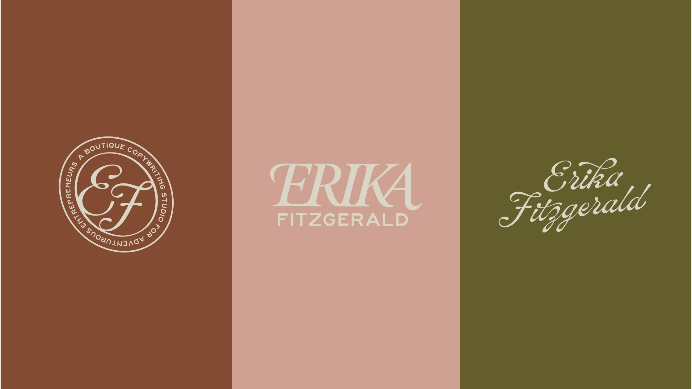
I worked with Erin at The Happy Brand to bring the brand visuals to life. After pouring over six years’ worth of application forms, client feedback, and audience research, we landed on an elevated camp vibe representing the “adventure of entrepreneurship.”
Erin knocked it out of the park with canvas textures, organic patterns, nature-inspired colors, and typography with a hint of retro flare. The primary brand for my copywriting studio feels like the perfect mix of high-end and approachable. We also created a more playful sub-brand for Copy Camp, the educational side of my business (coming soon!).
I’m usually on the vendor side of rebrands, so going through my own expanded my perspective. If you’re planning your own rebrand, I recommend this order of operations:
Step 01: Audience and market research
I use Google Sheets to organize all my competitor and audience research, including direct quotes from contact forms and client communications. You can read more about my research and copywriting process here.
Step 02: Brand strategy (visual and messaging)
I worked on my brand messaging strategy in tandem with Erin, who worked on the visual brand strategy. These two documents outline things like brand values, differentiators, audience personas, and mood boards to set the tone.
Step 03: Visual brand identity
Erin fleshed out the visual brand identity, including my primary and secondary logos, logo mark, color palette, typography, and patterns. She has a keen eye for strategic, user-friendly design – which makes her a great design partner.
Step 04: Brand photography
I knew I wanted to shoot with Jordan Quinn after seeing her work for Jenna Kutcher and Tonic Site Shop. I booked with Jodan right after confirming Erin’s design timeline because I wanted to have on-brand colors and collateral in my photos. Shooting with Jordan was a DREAM. A good brand photographer will often book out 3+ months in advance, so plan ahead!
Step 05: Website copywriting
While Erin and Jordan finished the visual elements, I got cracking on my website copy. If you’re working with a copywriter on your brand voice and web copy, I recommend looping them in from the very beginning. Otherwise, now is a good time to start on website copy so your copywriter can see the brand strategy and creative direction.
Step 06: Website design
The hill I’ll die on over and over again? Copy informs design. Even though I decided to use a Tonic template for this rebrand, I still wrote and formatted alllll my web copy in a Google Doc first. Then – and only then! – did I customize the template to fit my copy. As a final step, Erin applied my gorgeous new branding to the template.

5 things I did differently on my new website
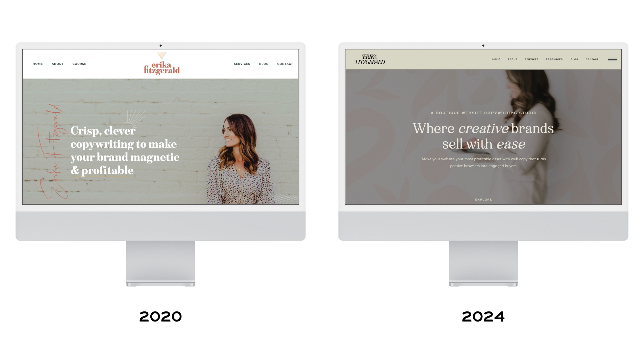
Speaking of website design, I did a few things differently with this rebrand. The goal? For it to feel like stepping off a busy street and into your favorite local bookshop. A cozy, creative sanctuary, if you will.
It was also important to keep it uncluttered and easy to navigate. Here are five decisions I made to achieve these goals:
1. Used a Tonic website template
When I switched from WordPress to Showit in 2020, I went with a custom website design. It cost more but left me with less flexibility to self-manage my website.
This time around, I decided to go with a Tonic template – and I’m so happy I did! I looked at a lot of Showit templates before deciding to go with Manhattan from Tonic Site Shop. They’re not the cheapest, but they include everything you could possibly need for your website. Jen and Jeff leave no detail unconsidered.
With a Tonic template, I was able to place my copy in design all by myself before passing the baton for Erin to brand it. The result? A custom-looking website I can update myself – for a fraction of the cost of custom.
2. Ditched the sliding carousels
Animations and sliding effects are fun – but when I looked at my own analytics and heatmaps, I noticed people were skipping over content that required extra clicks. Most concerning, they weren’t seeing anything beyond the first carousel slide.
So, I ditched the sliding carousels in favor of keeping everything visible on each page. No extra clicks required. On my previous site, my process and testimonials were hidden in carousel sliders. Now, they’re visible at all times.
This is why it’s important to follow your data – not your personal design preferences. In this case, my audience was scrolling (not clicking).
3. Created an offer ladder for different budgets and timelines
With my previous website, I had one service page with one offer: full brand voice development and website copywriting. While this mitigated decision fatigue and confusion for potential clients, it also alienated prospects who needed something different. In the past, I received messages like:
“I’m under a bit of a time crunch. I only have 3 weeks before I need to meet with my web designer, but I would be happy to do a smaller project than your 5-page package. In fact, that would be more affordable for me if you would consider it.”
And:
“If you’d be open to doing a few calls to help me figure some of this out and give feedback, I’d really appreciate it. I know I’d like to work with you on the full package at some point and really see the value in it, but just need some help getting started.”
The solution? I created a clear offer ladder, with each service rolling into the next tier. I still specialize in website copywriting, but now offer a day rate, a 2-week website copywriting package, and full brand voice + web copy service.
4. Book a VIP Day anytime, from anywhere
Clients under a time crunch don’t have time for email back and forth, discovery calls, and paperwork. That’s why I made the VIP Day stupid easy to book – from your phone while you wait for your latte order.
Brief backstory: I switched from Dubsado to HoneyBook last year (10/10 recommend – you can use my link for 25% off). One of many reasons: HoneyBook makes it easy to design and publish beautiful lead forms – like mine.
Now, prospects and repeat clients can review VIP Day details, schedule their day, sign the agreement, and pay the invoice in one swoop.
5. All the resources – all on one page
And if you’re reading this thinking, “Where can I find all the cool tools and templates you keep talking about, Erika?” You’re in luck because they’re all on my new resource hub, along with my free downloads.
After six years in business, I’ve curated the best business tools and resources. Consolidating all my favorite resources on one page makes it a) easy to share, b) pass along discounts, and c) earn a small commission when someone makes a purchase.
If you want to diversify your income, having a resource hub like mine is a great way to start. My page is built on the Favorites Page template from my friends at Tonic Site Shop (of course 😜).
And one thing I didn’t change?
Showit. I switched from Squarespace to WordPress in 2018 and from WordPress to Showit in 2020. Of all the website platforms, I love Showit the most. It offers endless control, design flexibility, and top-notch support. It’s truly, 100% drag-and-drop design.
I used to think WordPress was the best website platform for SEO – and that was true at one point. But not anymore. In fact, my SEO rankings have skyrocketed since switching to Showit with a WordPress-hosted blog. Win-win!
Want to give Showit a try? Use this link for a month free.
Think your website could use a refresh?
- Shop website templates: If you love my new website, you’ll LOVE the Showit templates from Tonic Site Shop. You can use my code COPYTONIC for 15% off your entire order →
- Hire me to write your website copy: Need help making strategic decisions for your next website? Request a free discovery call →
- Join the copy template launch list: I see you, DIYer. I built my business on templates – and now? I’m making copywriting templates for you. Join the launch list to know when doors open Fall ’24 →
Comments +